Hillside Terrace Complex
- place making
- open space
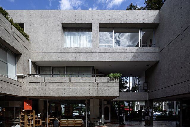
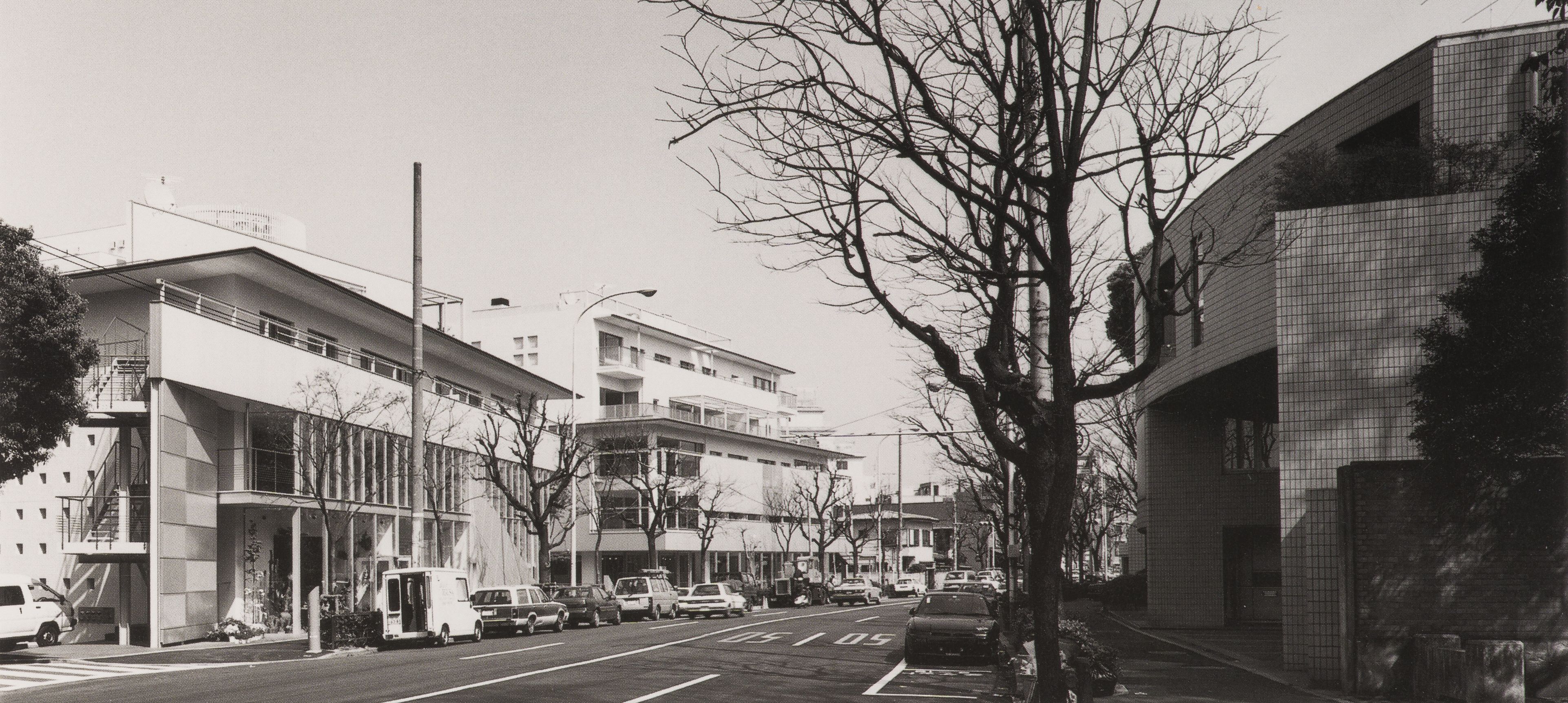
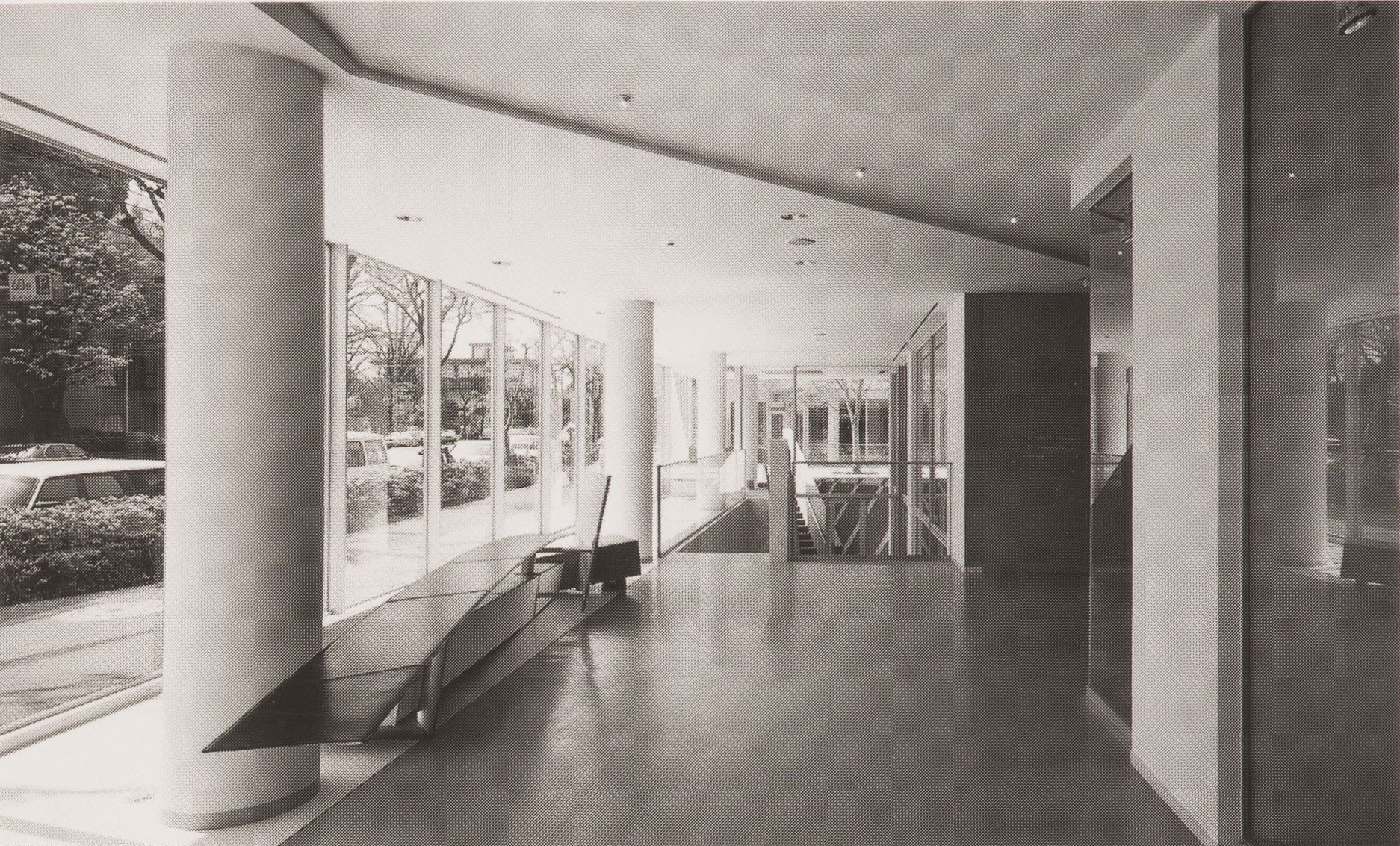
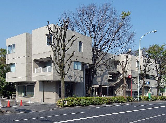
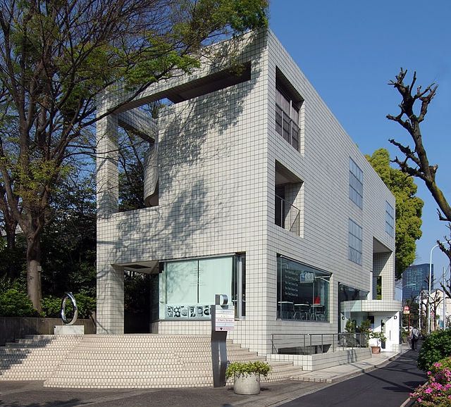
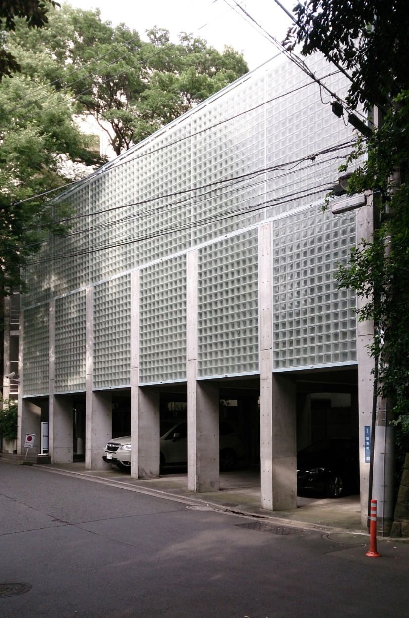
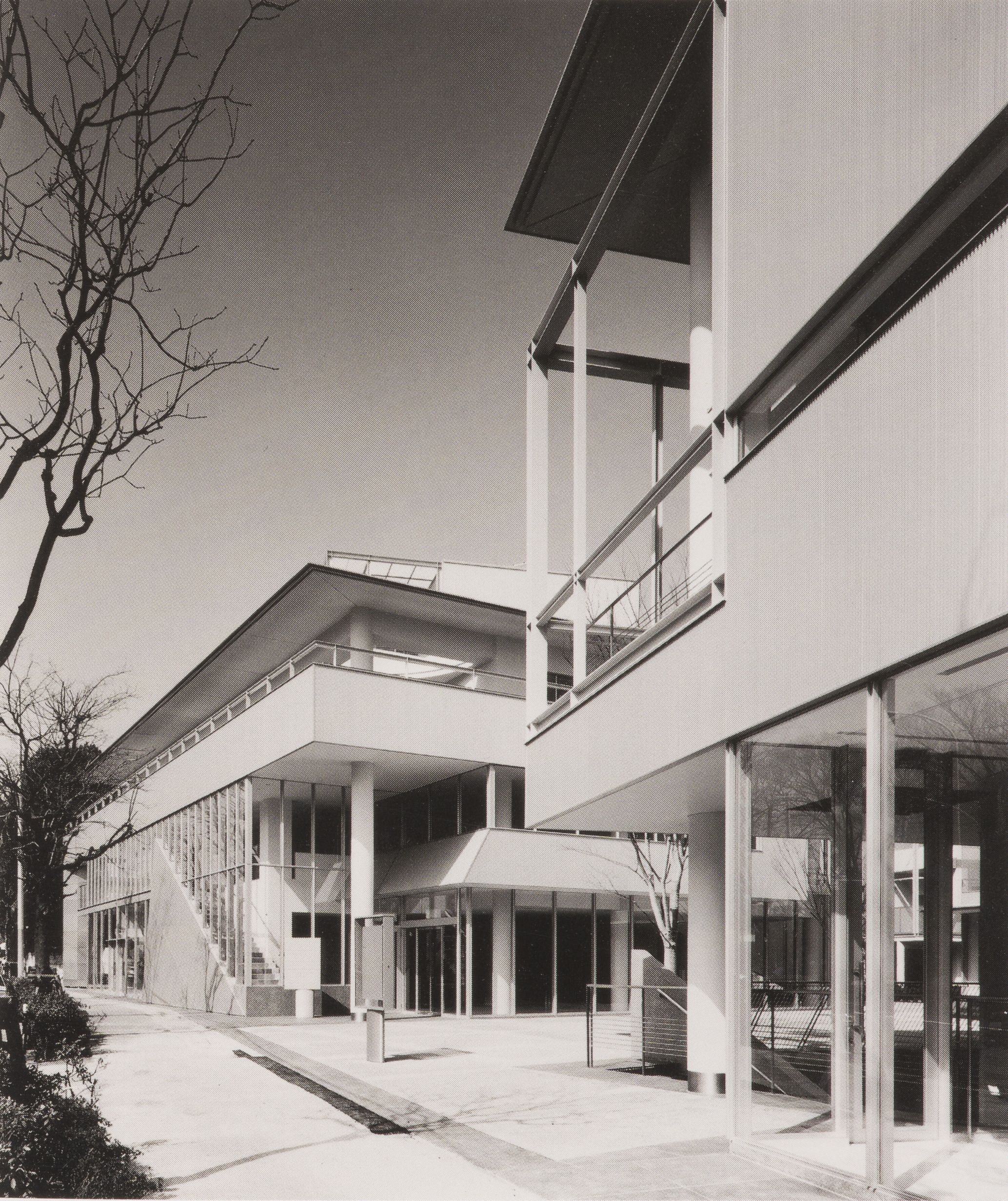
Hillside Terrace was a strip of land in a fashionable area of Tokyo known as Daikanyama. It was a forested landscape upon which only a few wooden houses were present, that belonged to the Asakura family. Once rice merchants who went on to become real estate moguls, the Asakura family wanted to develop their land incrementally to adapt to the increasing land values that was accompanying the urbanization in Tokyo. The project was conceived to be built over multiple phases. The owners wanted to develop it as a residential, commercial, and public space which would be best suited to its location. As the idea was to gradually develop the land, there were some special zoning permissions that were required along the entire timeline of the project as the site was originally zoned to be a strictly residential zone with a 10-meter height limit and floor area ratio of 150%. The special zoning permission allowed the designers to integrate commercial spaces into the project and increase the height of the buildings in the latter phases. The project was developed keeping certain themes in mind that remained constant over all the phases. It was conceptualized to maintain an intimate scale between the exterior and the interior spaces. The sidewalk, which was at the junction between the façade and the street, was designed to be a space for activity. The integration of platforms, paths, and stairs allowed a larger space for the residents of the city. It allowed a smooth transition between the street and the commercial spaces while preserving the privacy of the apartments on the upper levels, which was an essential aspect of the site that needed to be preserved. Maki’s use of time as a critical aspect of design is commendable in the project. Maintaining the historical character of the site, he created an aggregation of buildings and spaces along a major urban artery in Tokyo. He describes his work as ‘unclear wholes containing clearly defined parts’, which is clearly reflected in the Hillside Terrace complex. It respects what was present and gradually develops upon it and across time. This understanding still holds true in the new age of urbanism, where with our modern technologies to build rapidly and redundantly, huge developments are created wiping out anything that was present on site, thus compressing time. However, Maki proves that urbanity can only exist with incremental development of an area, slowly building upon what exists and building through a substantial period. Phase 1: The design started with Maki’s personal research and design called the group form which looked at aggregating spaces to develop an urban area. The spaces developed during the first masterplan were residences and shops. Inspiration was drawn from Mediterranean villages to develop the public and private spaces area developed in an interconnected manner. There was a raised pedestrian deck that ran parallel to the main street, allowing a transition between the sidewalk and the commercial spaces on the ground floor. Only two buildings of this masterplan were built on the eastern edge fo the site. The corner building had two floors of commercial space that were laid out around a transparent atrium and two floors of apartments. The second building hosted a basement restaurant, a floor of shops and apartments above them. The material used was exposed concrete, with large areas of glass that maintained a connection between the public spaces. Phase 2: By phase 2, there was considerable development that happened in nearby Shibuya which led to significant rise to traffic, noise and pollution along the major arterial road. The zoning laws were revised that did not permit further development of the maisonette type of apartments, which were the type of apartments existing in the first phase. Moreover, the raised pedestrian deck proved to be unsuccessful in the way it started being used by the shopkeepers. As a result, the design of phase 2 was considerably different than that of phase 1. The shops and the apartments would open into an inner courtyard to shield the spaces from the noise and pollution from the street. Thus, the street façade became a solid edge, and the inner passageways were now spaces that allowed more freedom and maintained transparency with the public spaces. Exterior stairs continued to be an important element that framed the urban landscape. Maintained from Phase 1, the commercial spaces on the ground floor, above which lay a floor of offices and apartments. The third floor was the living space and common space for the Asakura family. Phase 3: As development continued in Tokyo, the site gained more and more popularity. The spaces conceived as apartments in the previous phases were being converted into offices. The two new buildings that came up in phase 3 drew from the success of the inner courtyard, thus generating a larger courtyard into which the spaces opened to. The ‘kofun’ was now nestled between the space created by these two buildings, thus protecting it from the street and marking it as a place of importance within the entire project complex. A departure from the original design is noted in the circulation spaces which now were largely interiorized in contrast to the exterior stairs. The materials used were square ceramic tiles, glass blocks and transparent as well as translucent glass for the façade. The use of the translucent glass allowed a level of privacy to the apartments while allowing daylight to infiltrate the spaces. Intermediate phase - Royal Danish Embassy: A portion of the westernmost edge of the site was sold of to the Danish government during the development of Phase 3 by the Asakura family. As the rest of the land was developed by Fumihiko Maki and associates, the design of the new building on this site was carried out by the same designers to maintain a harmony between the existing and the new building. For security reasons, the embassy needed to have high walls to separate pedestrian activity from the site in this area. Continuity was maintained by pushing the office to the front line where it acted as a wall between the street and the inner spaces. The idea was to create a clear distinction between the embassy and the rest of the complex while maintaining the urban character of the site. Phase 4: This phase was developed on two small properties that earlier lay adjacent to the original Hillside Terrace. There was a need to house the offices of Asakura Real Estate. Hence two buildings were conceived that had raised offices to allow parking on the ground plane. The form of these buildings was cylindrical which lay in contrast to the straight edged buildings of the main complex. Phase 5: In 1985, the plot between the Phase 1 and Phase 2 buildings was proposed to be developed as a space for exhibition and public gathering. Maki associates designed this by pushing the large exhibition space underneath the ground floor, allowing the ground plane to be developed as an open plaza. This exhibition space was envisioned to house fashion shows, concerts, parties and exhibitions underground while the ground floor had two small pavilions that housed the ancillary functions of the spaces. Phase 6: In 1990, the area was rezoned to a residential II zone, removing the restriction of the 10-meter height, and allowed for the development of FAR 2. Under these new regulations, Phase 6 was conceived on the last piece of land owned by the Asakura family: a plot that lay on the northern side of the adjacent street. This phase included buildings that were taller than the others throughout the site but the continuity was maintained by having sharp, overhanging eaves at a height of 10 meters and pushing back the volume above. This fragmented character allows for an intimate scale with the street while accommodating an array of programs. Phase 6 included three buildings which had commercial spaces on the ground floor and basement, and offices and residence on the upper stories. The buildings also incorporated public spaces such as an art gallery, a media activity center, a tearoom, and an interior water court. The material used for the construction of this phase was perforated metals and composite curtain walls which was a big change from the materials used earlier.
Project Leads
- Maki and Associates
Organizations
- Maki and Associates
- Yamaki Structural Engineers
- Aoki Structural Engineers
- Sakurai Consultants
- Sogo Consultants
Stages
- Construction
- Design Development
- Schematic Design
- Planning
Site
Typology
NALand use type
Mixed UseSize
24625 square metersGross floor area
17256 square metersFloor area ratio
Phase 1 to Phase 5: 1.5; Phase 6: 2.0Community Infrastructure
- art programs
- cultural programs
